How to Find High-Intent Local Businesses on Google Maps (Step-by-Step)
Google Maps has never been short on businesses. The challenge has always been knowing which ones are actually worth your time.
If you’ve ever gone down a Maps rabbit hole—opening listing after listing, mentally tracking which ones felt promising—you already understand the problem. In the moment, the signals are obvious. A business looks active. Reviews feel real. The website looks maintained. Something about it just works.
Then you move on.
Ten minutes later, you can’t quite remember why one listing stood out more than another. Everything blurs together. What felt like confident judgment turns into guesswork when it’s time to decide who to contact.
Finding businesses on Google Maps is easy.
Identifying high-intent businesses consistently is not.
This guide focuses on that gap: how to spot businesses that are not only real, but actively operating, responsive, and more likely to engage—without turning research into a slow or fragile process.
What “High-Intent” Actually Means on Google Maps
On Maps, intent doesn’t come from keywords or ad spend. It comes from behavior.
A high-intent business is one that shows signs of ongoing attention—by its owners, its customers, or both. These are businesses that are open, active, and invested in how they appear to the outside world. Not necessarily perfect. Just present.
Importantly, intent on Google Maps is rarely communicated through a single signal. It’s a pattern. A combination of small indicators that, together, suggest a business is reachable and worth engaging.
The goal isn’t to eliminate judgment. It’s to support it.
Step 1:
Start With Signals That Indicate Ongoing Activity
The first thing to look for is not volume, but recency.
Reviews are the most obvious place to start, but the raw number matters less than when they’re happening. A business with a modest number of reviews that received several in the past few months is often more active than one with hundreds that hasn’t seen engagement in years.
Photos tell a similar story. Recent uploads—especially owner-posted photos—are a strong indicator that someone is paying attention to the listing. Even small updates suggest the business hasn’t been abandoned or forgotten.
You’re not looking for polish here. You’re looking for signs of life.
Step 2:
Pay Attention to How the Business Presents Itself
Google Maps exposes details that most curated platforms smooth over.
Category choices are a good example. Businesses that clearly define what they do—and don’t try to be everything at once—tend to be easier to qualify later. Vague or overly broad categories often signal confusion internally, which usually shows up during outreach.
The same applies to business descriptions and websites. You don’t need perfect copy or modern design. You’re looking for coherence. Does the listing match the site? Does the service offering make sense for the location and category? Do things feel maintained rather than abandoned?
These are small details, but they accumulate quickly when you review listings side by side.
Step 3:
Look for Responsiveness, Not Just Reputation
A five-star rating doesn’t automatically mean a business is a good lead.
Responsiveness is often a stronger indicator of intent than reputation alone. Businesses that reply to reviews—especially neutral or negative ones—are signaling that they monitor feedback and care about perception. That usually correlates with openness to conversation elsewhere.
Likewise, businesses that update hours, respond to Q&A, or correct listing details tend to be easier to engage. These are subtle signs that someone is paying attention to inbound communication.
Silence, especially over long periods, is usually intentional—or the result of neglect. Neither is ideal for outreach.
Step 4:
Compare Listings While the Context Is Fresh
This is where most workflows break down.
When you’re browsing Google Maps, your judgment is sharp. You notice differences instinctively. One business feels established but stagnant. Another feels smaller but active. A third looks good on paper but oddly disconnected.
The problem is that this context fades almost immediately once you move on.
If you rely on memory—or try to reconstruct decisions later from a spreadsheet—you lose the nuance that actually drove your judgment in the first place. High-intent signals don’t always translate cleanly into columns.
The key is to capture decisions while you’re browsing, not after. That’s what turns one-off judgment into something repeatable.
Step 5:
Turn Browsing Into a Repeatable Qualification Process
The most effective Google Maps workflows don’t try to automate away human review. They reinforce it.
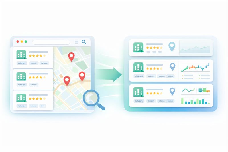
Instead of extracting everything and filtering later, the goal is to preserve the context that mattered at the moment of discovery—why a business stood out, what signals were present, and how it compared to others you saw nearby.
When that happens, Google Maps stops being just a discovery tool and becomes a qualification engine. You’re no longer second-guessing past decisions or re-opening the same listings to remember what caught your attention.
This is the difference between “research” and progress.
Tools like Lead3r are built around this exact idea: allowing you to research and qualify businesses directly from Google Maps, while capturing the signals and judgments that actually matter—before they disappear.
When Google Maps Is the Right Channel (and When It Isn’t)
Google Maps works best when relevance matters more than scale.
It’s especially effective for:
- Local and regional service businesses
- Agencies targeting SMBs
- Consultants selling high-trust or high-touch services
In these cases, a smaller list of well-qualified leads almost always outperforms a massive list generated without context.
If your strategy depends purely on volume, Maps may feel slow. But if your outreach depends on fit, timing, and responsiveness, it’s one of the clearest windows into how businesses actually operate.
Turn Any Business Into a Qualified Lead in Seconds
Stop wasting time opening tabs, copying data, and guessing who is worth contacting.
No credit card required
Latest Articles
Stay up to date with practical guides on extracting leads, qualifying prospects, and sending smarter outreach. Every post is written for freelancers, creators, and operators who want faster, clearer prospecting workflows.


